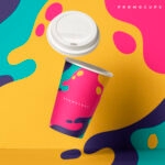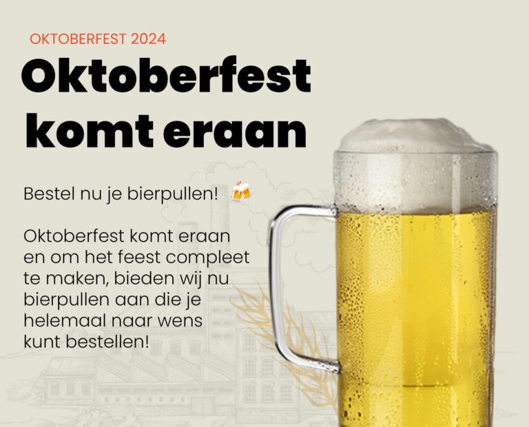
A printed cup may seem simple, but behind every successful promotional cup lies a well-thought-out design.
Your company name isn't just there for the sake of it. It needs to stand out, be memorable, and above all, not irritate, because no one likes to drink from a cup that screams for attention.
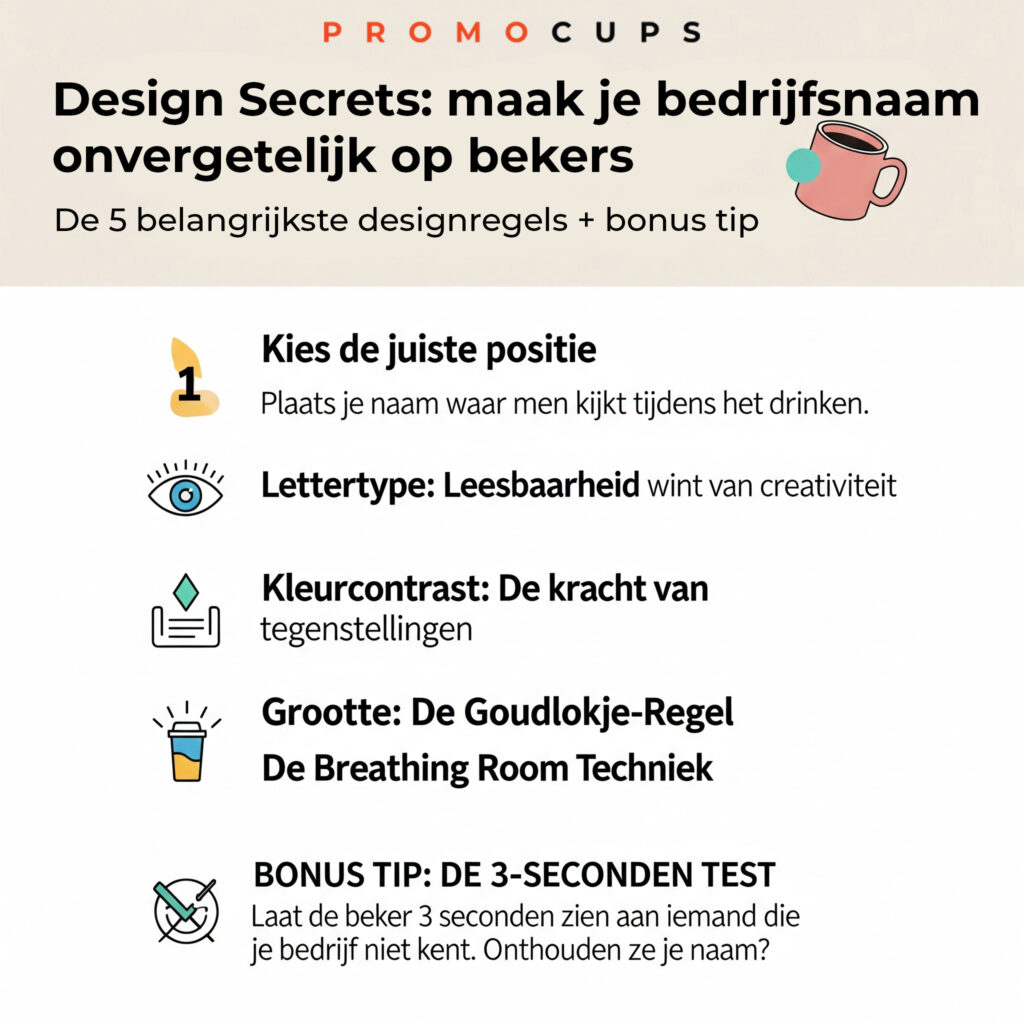
After years of research into what works (and especially what doesn't) in cup branding, we're sharing the five key design rules that make the difference between a cup that disappears into the cupboard and one that's used every day.
- Choose the right position: Where eyes naturally go
The Problem: Many companies put their logo all over the cup or choose a random spot without thinking about how people hold a cup.
The Solution: Position your company name in the "sweet spot," which is the area that remains visible when someone holds the cup.
For: Logo on the bottom or exactly where the thumb goes – After: Logo on the top of the cup, diagonally opposite the handle
Practical Tip: Test this yourself by holding an empty cup. Where does your gaze naturally fall? That's where your company name belongs. For right-handed people, this is usually the left side of the cup (from their perspective), and for left-handed people, the opposite is true.
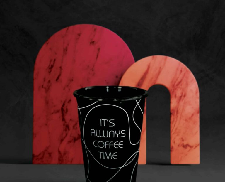
- Font: Readability trumps creativity
The Problem: Fancy fonts that look great on business cards are often illegible on the curved surface of a cup.
The Solution: Choose a sans-serif font with sufficient thickness. Letters should be at least 8mm high to remain legible.
For: Thin, ornate fonts like Scriptina or overly decorative fonts – After: Bold, clear fonts such as Arial Bold, Helvetica Neue or Montserrat
Why This Works: Sans serif fonts retain their shape better when printed on curved surfaces. The thick lines ensure your company name remains visible.
Practical Tip: Print your company name in different fonts on paper and view them from 2 meters away. Which ones can you still read effortlessly? These fonts are suitable for your mug.
- Color Contrast: The Power of Opposites
The Problem: A dark blue logo on a black cup or yellow on white, both are practically invisible and waste your marketing budget.
The Solution: Use the 70/30 contrast principle. Your main color should have at least 70% contrast with the cup color.
Successful Combinations:
- White text on dark blue, black or dark green cups
- Dark blue or black text on white, light gray or yellow cups
- Red on white (classic and always eye-catching)
For: Subtle color differences that appear 'elegant' – After: Clear contrasts that are still visible from 3 meters
The Scientific Side: Our brain processes high-contrast information three times faster than subtle differences. High contrast ensures that your company name is subconsciously recognized and remembered faster.
- Size: The Goldilocks Rule
The Problem: Text that is too small is unreadable, text that is too large feels intrusive and cheap.
The Solution: Follow the 15-20% rule. Your company name may cover a maximum of 15-20% of the visible cup surface.
Practical Dimensions:
- Standard cup (330ml): Company name between 40-60mm wide
- Large mug (450ml): Company name between 50-70mm wide
- Travel mug: Company name between 30-45mm wide (due to the narrower shape)
For: Company name that dominates the entire cup – After: Company name that stands out but leaves room for the eye to rest
Why This Works: People associate overly large text with cheap promotional items, a more subtle approach suggests quality and professionalism.
- The Breathing Room Technique: Space Creates Impact
The Problem: Company names squeezed between other elements or logos that reach the rim of the cup.
The Solution: Create breathing space around your company name. At least 10mm of free space on all sides.
The Technology in Action:
- No other elements within 10mm of your company name
- Use the curved shape of the cup as a natural 'frame'
- Leave the bottom and top of the cup free of text
For: Packed design with logo, company name, website, phone number and slogan – After: Just your company name with plenty of white space around it
Psychological Impact: Space around text increases brand value by approximately 25%. It suggests quality, calmness, and professionalism—traits that people subconsciously associate with your company.
Bonus Tip: The 3-Second Test
Before you finalize a design, do the 3-second test:
- Show the cup to someone who doesn't know your company for 3 seconds
- Turn the cup away
- Ask what they remember
If they can repeat your company name, you have a winning design. If not, you still need to fine-tune the contrast, size, or position.
Common mistakes that cost you money
Error 1: Use the same design as on your business card –Why it fails: What works on paper doesn't automatically work on a curved surface
Error 2: Too much information on one cup –Why it fails: People only remember one thing at a time. Focus on your company name.
Error 3: Following trends instead of making timeless choices – Why It Failed: A cup lasts for years. Trendy fonts will be dated in two years.
The Investment Worth
A printed cup is seen an average of 1,200 times a year by the user and people around them.
The right design choices ensure that your company name stands out and is remembered every time.
Remember: your company name on a cup isn't decoration; it's a daily reminder of your brand.
Make it something that makes people happy, not annoyed.
With these five design rules, you can transform a simple cup into a powerful marketing tool that people actually want to use, and that's exactly what effective brand promotion is all about.